If you’re a fan of English sparkling wine listen up, because you can now, quite literally, paint your home in it.
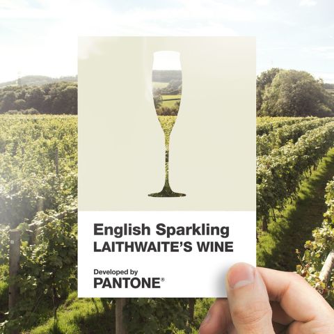
Paint brand Valspar has teamed up with Laithwaite’s Wine and the Pantone Colour Institute to bring the colour of English fizz to life.
The result? A brand new shade called English Sparkling that’s perfect for a refreshing spring/summer update in your home. Developed by the global colour experts at Pantone, the subtle and stylishly elegant shade takes cues from the soft and creamy hues of sparkling wine.
Pantone says… “A subtle and stylishly elegant, creamy hue that quietly expresses effervescence and good taste. Young in spirit and timeless in its appeal, this natural off-white shade conveys feelings of spring freshness and modernity. Carrying an undertone of pleasantness and geniality, the inherent warmth of Laithwaite’s Wine English Sparkling creates a sparkling yet soothing presence.”

Last October, data from accountancy firm UHY Hacker Young revealed sales of sparkling wine were booming, having shot up by 76% over the last five years.
Just before Christmas, supermarket Tesco even noted that Champagne customers were switching allegiance and buying English sparkling wine. Sales data from the supermarket revealed that nearly a third of the their English sparkling wine customers previously bought Champagne.

“The quality of English sparkling wine has massively improved over the last few years and there has been a lot of investment in production techniques and especially in the actual growing of the grapes as well as training, knowledge and expertise of English winemakers,” said Rob Dixon, Tesco Champagne and sparkling wine buyer.
“Just as Burgundy and Champagne are very well-known terms for colours it’s now time for English Quality Sparkling Wine to take centre stage,” said David Thatcher, CEO of Laithwaite’s Wine. “Creating an official colour is a great way of acknowledging the ever-growing popularity of the English wine industry around the world.
“Barbara Laithwaite’s Wyfold Vineyard Brut has long been a front-runner in the category, so it was the perfect fizz to inspire the definitive colour – and feels far more spring-like than painting the town red.”
Valspar has responded to its meteoric rise in popularity over the last few years by bringing its colour to life, by way of paint, for the very first time.

“English Sparkling is more than just a new shade of Valspar paint. Like every bespoke colour we mix, it’s about eternalising a personal feeling, a moment in time, a memory,” says Kasia Wiktorowicz, marketing communications manager at Valspar. “For us, this colour is reminiscent of a warm laughter-filled summer’s evening, enjoying an English Sparkling wine with close friends and family. We’re proud to be able to bring those moments to life with our paint colours, in homes and gardens.”

Laurie Pressman, VP of the Pantone Colour Institute, added: “As a universal language, colour is a great way to communicate worldwide. We are honoured to be involved in the creation of this new unique off white shade, English Sparkling Laithwaite’s Wine. A colour of its time, the tasteful shade recognises and symbolises the growing prominence of the English Wine industry.”