The budget was a major consideration for the project, so the architects found clever ways to use inexpensive materials.
Many clients are wary of taking too many design risks. But a young Brooklyn couple with a baby on the way knew that they wanted to take chances with the design of their Fort Greene townhouse. The narrow home, which is less than 12 feet wide, had been previously renovated, but lacked personality. With the help of Rustam-Marc Mehta and Tal Schori of GRT Architects, they set out to make a space that was original, colorful, and felt like home. “We all were eager not to design by picking ideas from Pinterest,” says Mehta, “so we let the process run its course and ended up with some unique moments.”
The budget was a major consideration for the project, so the architects found clever ways to use inexpensive materials. Penny tile creates a fun effect on the walls of the master and kid’s bathrooms, while simply painted wainscoting makes a big impact on the master bedroom. No space was left bland, from the ombre foyer to the inventive stairwell, which uses several types of textured prismatic glass. The end result is totally unique and unlike anything you’d find on Pinterest — well, until now, that is, because we are totally pinning every single idea here.

The architects turned the boxy vestibule into an arched entryway and created a custom ombre wall treatment with Calico Wallpaper. A wall light by Bega and brass hooks make the space extra functional.

Mehta and Schori kept the living room bright, so the narrow space wouldn’t feel like a hallway. They installed a seating nook to hide the radiator and chose a sculptural ceiling light by Areti to illuminate the BDDW sofa, Hans Wegnerlounge chairs, and Hagit Pincovici table.

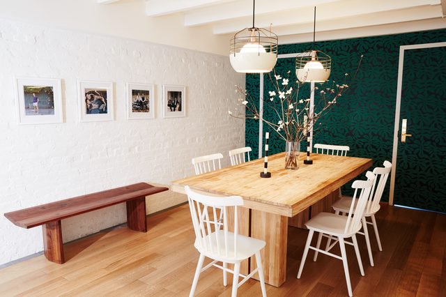
A coat of white paint keeps the dining room, which doesn’t receive direct light, from feeling cave-like. A Paper Mills botanical-print wallpaper covers one of the walls and the pendant lights are by Roll & Hill.

The staircase is located in the center of the house and is visible from almost every room. The architects completely redesigned it using different densities of fluted glass to let light pass through and provide privacy.

In the master bedroom, the team installed tall wainscoting, painted in a Farrow & Ball gray-purple. The DWR bed is paired with Gubi wall lamps and a vintage side table acts as a nightstand.

Round tiles by Waterworks were used to create a playful zig-zag pattern in the master bath. Black fixtures by Brizo contrast with the pastel palette.

A black-and-white Ferm Living wallpaper adds fun to the nursery. An Eero Saarinen Womb chair and a vintage Moroccan rug add pops of color to the space.

The kid’s bathroom is a playful mix of shapes and colors. The penny tiles are by Daltile, the custom shelf is by Chiaozza, and the faucet is by Vola.


