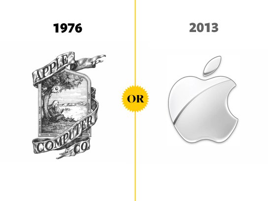
The Microsoft logo beefed up, the Apple logo stripped down, and McDonald’s used to be a “famous barbeque.” You decide whether these famous company logos changed for the better, or worse.
Yahoo!

Like a persnickety bride before her wedding, Yahoo! Inc. tried 30 new looks for 30 days in a row before settling on the clean purple getup you see here. The logo redesign is tame compared to some other contenders, sticking close to the company’s original 1994 design. Other corporate redesigns have not been so conservative. Click through to see how far some companies have come, and let us know in the comments which looks better: the old, or the new.
Microsoft

Starbucks

Apple Inc.

McDonald’s

Coca Cola

National Broadcasting Company

Burger King

Firefox

Mercedes-Benz

Google


