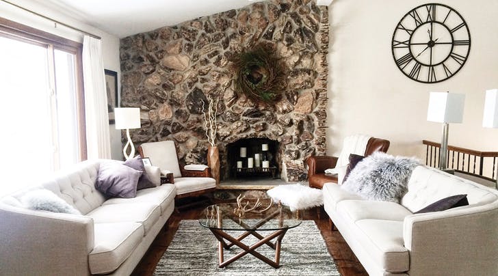
Hey, we can appreciate all home aesthetics. (Bohemian? Love it! Minimalist? Impressed by it! Rustic farmhouse? Can we move in immediately?) But there are certain no-nos we just cannot abide. Here, eight that are driving us totally bonkers. Consider this your official cease and desist.
1. You’re hanging your art too high.
When it comes to decorating, there’s one hard-and-fast rule: The center of any painting should be at eye-level. (That’s about 58 inches off the ground, in case you were wondering.) Learn it, live it, then get on with your life.
2. You’re pushing all your furniture against the walls.
We know it can feel weird to float a sofa in the middle of the den. But pushing everything against the wall creates an overly formal vibe… not to mention a weird space in the middle of the room. Move furniture into groupings for a cozy, lived-in feel.
3. You’re afraid of color.
We love the monochromatic white thing as much as the next Hamptons magazine enthusiast. But your home will be a sad, sad place if every room doesn’t have at least a few pops of color. Consider it an excuse to buy that cute turquoise serving tray you’ve been eyeing.
4. You’ve got too many pillows on your couch or bed.
Yes, throw pillows are a great way to add patterns and color to an otherwise neutral space. But if your guests have to remove cushions just to put their butts on the love seat, you know you’ve gone overboard.
5. You’re too trend-driven.
Copper, chevron, reclaimed wood–there’s nothing wrong with hopping on the trend bandwagon. But beware of using too much in one room, or risk a house that looks really dated in a few years’ time.
6. You’re too matchy-matchy.
Think both bedside tables need to be identical? Think all your dining room furniture should come from the same collection? Think again…then start mixing and matching patterns, materials, eras and the like.
7. You’ve made the TV the focal point of the room.
Yes, Netflix is a gift sent from heaven. No, that does not mean you need to treat your television set like the most beautiful object you own. (We promise; it’s not.) Instead of mounting it front and center in the middle of your living room, consider placing it off to the side, concealing it behind a cabinet or mixing it into a gallery wall.
8. You forgot about lighting.
“Wow, that overhead light gives off such a cozy, flattering glow,” said no one ever. Mix standing and table lamps into your design, and consider putting your ceiling fixtures on dimmers. The effect will be homey and sophisticated–and not at all like a dentist’s waiting room.


