GETTY ASTRONAUT IMAGES
Some interior design trends come into existence for only a fleeting moment before disappearing into the style graveyard, while others stick like glue, adapting and transforming in style as time goes on.
But which of these apparently stylish trends could actually be having a negative impact on your property value?
We spoke to a whole host of interior designers and property experts to find out which contemporary interior design trends may actually be devaluing your property.
‘I think any trend that could be marmite for some people and expensive to change can put people off as it’s so expensive to buy a house these days,’ says Stacey Sibley, creative director of Alexander James Interiors. ‘If you then have to spend a lot changing it all, it could potentially lose you a sale.’
Take a look at these 11 supposedly stylish trends that may affect the sale of your home…
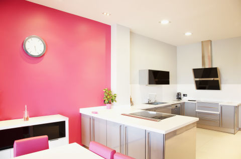
1. BRIGHT COLOUR SCHEMES
‘Garish colours are an instant turn-off. Keeping colours and design fairly neutral when selling your home can make it a more attractive option for buyers. Likewise, in the garden, brash, bright and shiny paving will also put buyers off. Ultimately, when selling your home, it’s important to be honest with yourself – if your taste wouldn’t have mass appeal, it is worth investing in expert help to present your house in the best possible light. Paying an interior designer or home stager could be worth it in the long run.’ – Richard Barber, director of JLL
‘Coloured kitchen units with gold handles is a trend which is very marmite and expensive to change, which can put off potential buyers – choose those colour palettes with caution.’ – Stacey Sibley, creative director of Alexander James
‘Most men don’t like hot pink and find it very hard to see beyond this styling which is currently ubiquitous amongst home stylists for new builds.’ – Rachel Johnston, Stacks Property Search
GETTY MARTIN BARRAUD
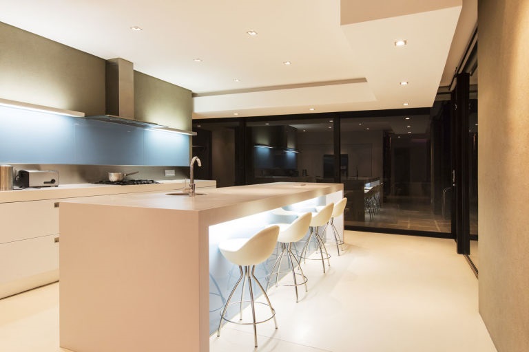
2. LARGE, SLEEK KITCHEN UNITS
‘I think giving your kitchen strong, sleek and stylish units is fashionable, however, it may not be a great idea if you are planning on putting your property on the market any time soon. Because they cover a sizeable area of your kitchen, your kitchen cupboards have great influence over how your kitchen looks and feels.’ – Vanessa Arbuthnott, interior designer
10 KITCHEN DESIGN TRENDS WE’LL BE SEEING IN 2017
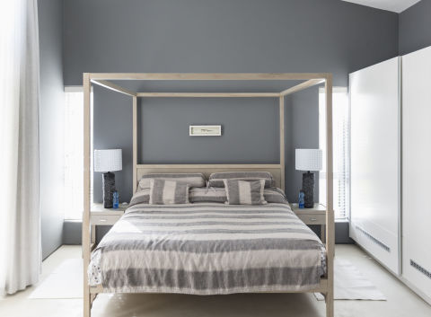
3. BLACK OR GREY DECOR
‘While material and cabinet door styles are all important issues to think about, the colour is often what pops out when one enters the kitchen. If you are going for a super luxurious look, black and grey will work best, but you may be decreasing the value of your house. Most people like their kitchen cupboards in a soft neutral colour.’ – Vanessa Arbuthnott, interior designer
‘It’s very fashionable to have dark black/grey painted skirting and doors with brightly coloured or patterned wallpaper. This could be very off-putting. If you are trying to sell a property, painting over dark coloured paint is a nightmare and stripping a whole room of wallpaper can be costly if you don’t do it yourself.’ – Stacey Sibley, Alexander James
‘Grey/greige doesn’t photograph well, so in this age of people judging solely on online images whether to view the property, a house tastefully done in grey throughout looks gloomy rather than stylish and puts potential viewers off.’ – Rachel Johnston, Stacks Property Search
-body–content”>
GETTY HOXTON/MARTIN BARRAUD
4. UNSYMPATHETIC CONSERVATORIES
‘Unsympathetic conservatories that have not been thoughtfully designed and do not match the style of the rest of the house, while providing extra square footage, can put a buyer off if they add nothing to the appeal of the property.’ – Richard Barber, JLL
5. ALL WHITE
‘The white-on-white trend is never likely to go out of fashion, but it will always be a big commitment in terms of upkeep. Nothing catches the eye more than when something is out of place. If you want to keep things simple, introduce colour accents through accessories, greenery and wallpaper to add depth and texture.’ – Jayson Branch, Castrads.

6. HIGH-TECH FEATURES
‘Some developers focus too heavily on technology, installing the latest systems such as advanced lighting controls and complicated sound systems. This can reduce the value of a property as buyers often feel that they are paying for a system that they will never use and actually prefer good old fashioned switches and dimmers or simpler technology.’ – Caspar Harvard-Walls, partner at Black Brick

GETTY ASTRONAUT IMAGES
7. SHOWER ROOMS
‘Niche developers who are building one property at a time, tend to leave little space for wet room facilities. They put in designer shower rooms which actually reduces their target market. Many buyers want the flexibility of having a bath or a shower. In fact, I have one client that has made having a bath in the bathroom part of her search. I have previewed numerous refurbished apartments in Holland Park which are perfect bar the shower room. You could think, “well surely you could add a bath” but many clients looking for the finished article, haven’t got the desire, nor the time to do this.’ – Matthew Turner, CEO of Astute Property Search
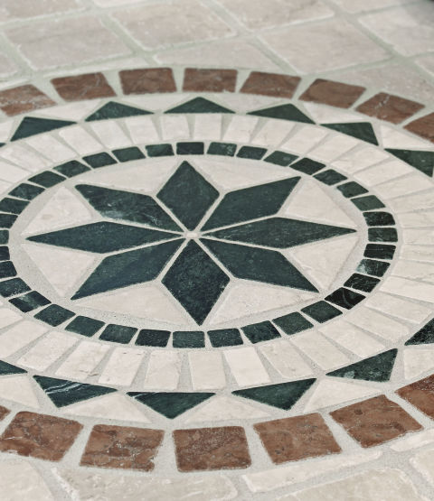
8. PATTERNED FLOOR TILES AND CARPETS
‘Patterned bathroom floor tiles are very on-trend at the moment but again are costly to replace so don’t go too wacky. Brightly coloured and patterned carpets in hallways are also on-trend but are not everyone’s cup of tea and expensive to replace.’ – Stacey Sibley, Alexander James
GETTY
9. COPPER OVERLOAD
‘With so many copper items available for our homes, it’s easy to go overboard. A little copper goes a long way so use sparingly to add a warm glow to a room, especially when contrasted with light natural materials like wood and stone. While not a trend to avoid completely, restraint here is key to achieve a sophisticated look.’ – Jayson Branch, Castrads
10. RECESSED APPLIANCES (AND POOR LAYOUT DESIGN)
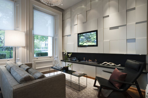
‘Not long ago I valued a mews house in a super prime mews street. Originally 1,200 sq ft, the couple had completed its refurbishment and added a 500 sq ft basement. Being on the rich list they were fabulously wealthy and had spared no expense so the result was good. However, it just didn’t feel like the 1,700 sq ft the owners were claiming it to be.
‘In their minds they were sitting on a house worth up to £4,800,000 so when I measured the house at 1,470 sq ft they almost laughed me out of the house. On studying the floor plans it became clear – the owners had wanted the walls to be made flat and soundproofed. So to allow the fitting of hidden recessed wall edge lighting, recessed televisions, downpipes and utilities, the walls were brought forward. By doing this they had in reality paid their architect to lose them a theoretical £750,000 worth of resale value.’ – James Robinson, general manager at Lurot Brand
GETTY ANDREAS VON EINSIEDEL
Source: housebeautiful


